Monday, 19 April 2010

Website Research - Cheshire Farm


What I like most about this website is the use of illustration and a simplistic layout. They use the illustration mainly in the background of their website and include such elements as a cow and Navigation (below).

Also like Amy’s website (www.amysicecreams.com), they use a vast range of colour throughout there website. This seems to be a popular colour theme to have on an ice-cream based website. The reason I think websites might use this colour theme is to keep viewers interested through using various bright colours?

This websites navigation is simple and easy to read. They use a 3 column layout structure which makes good use of the space. I don’t like how much text they have running throughout the site. This can be putting off by either viewers getting bored/not reading. If they are prioritising to appeal to a young audience then they should keep limited.

Website Research - Amys Icecream


I really like Amy’s Icecream website because it is colourful and enticing. Amy’s use of a fully interactive website not only draws you into exploring, but use of simplistic navigation keeps it understandable for everyone. I like how they have used an icecream on top of a cone as the basis of the world. This is a great way of enticing viewers into buying the product.

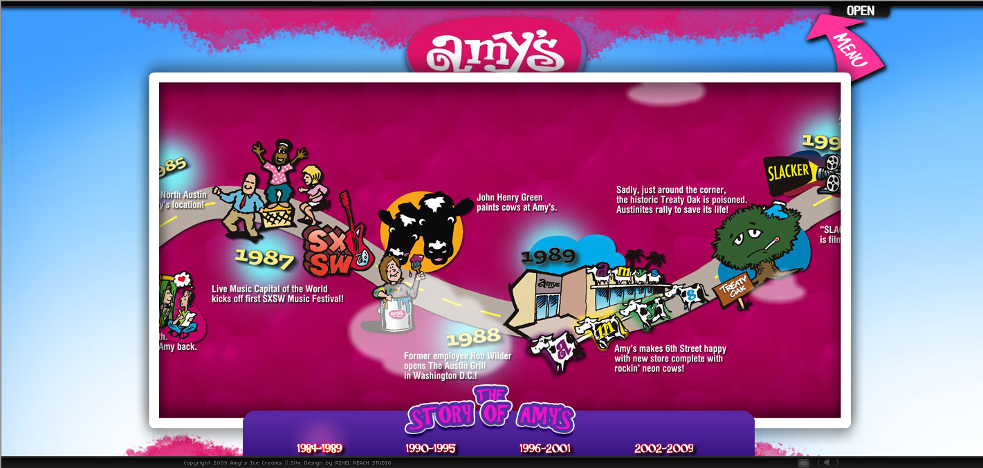
Another great feature is in the way they present the history/company details in an interactive timeline (below). This is a very good way especially for a young audience to grasp the concept of information using images. Another good use of illustration I like is the loading bar; they use the company’s cartoon (a cow) as the background as the numbers start to count up.


Sunday, 18 April 2010

Friday, 16 April 2010

12
3 Wire frame 3, flash based introduction, the box's will be images that act as links. They will be part of a bigger image in the background

4

5

6
7
Wire frame 7 is designed for a wide screen. Scrolls across automatically to view hidden content.
8
9
10

1950’s American Diner Research


The American Diner were generally found in the in the north eastern states of the USA, specifically Long Island New York. Traditionally shaped like mobile homes with a narrowed elongated shape. The two main periods for the American Diner are the 1950’s and the 1970’s, these hold many different characteristics. The 50’s diner was bright and white look and atmosphere where as the 70’s diner would have darker colours such as browns and blacks.


The architecture tended to be of stainless steel finish, chromed panels, tiled floors, porcelain enamel, glass blocks, terrazzo floors Formica and neon sign trim.


Typical food to be sold in a diner would be hamburgers, French fries, club sandwiches, all day breakfast and a range of deserts such as cheesecake and ice cream.All of the food sold would be at a reasonably cheap price for the time period.


The counter would generally have a row of stools fixed to the floor with various tables placed along the window to fit in with the elongated shape.


Ice cream brands


Ben and Jerries, Haagen Das and Baskin robins are three of the most famous ice cream brands throughout the world. Each one has become a household name in it's own right. All three are known for different reasons. Ben and Jerries comes from humble beginnings of two friends quitting uni and spontaneously creating fmaous flavours such as cookie dough and fish food. Haagen das is known for it's luxurious ingredients.
What makes these brands successful? I think they all bring a sense of relaxation, comfort and self indulgence that we are all attracted to.
In terms of design they are all very different companies, pitching to different audiences. Haagen das uses rich colours to suggest high class decadence. Whereas Ben and Jerrys and Baskin Robins (the American companies) have gone for a bolder, more fun design that makes use of colour and fun typography to attract their audience.
Yumi's Brand: I think Yumi's brand is about bringing people together of all nationalities, ages etc to enjoy a fun, sleek 50's style diner. I want to advertise their 50+ flavours of ice cream, the late closing times (to attract students). Also a USP is that it is owned by a young 3rd year student so it suggests friendliness and opportunities.

YUMI's plan

  1. Meeting with Client 01/04/10 - 28/05/10
  2. Research-50's style/ American diners, ice cream parlours, ice cream bands/ illustrations 3 Days 14/04/10 - 16/04/10
  3. Content 19/04/10 - 21/05/10
  4. Photoshoot 2 Days 14/04/10 - 15/04/10
  5. Wireframes 16/04/10
  6. Mock-ups 21/04/10 - 23/04/10
  7. Flash game 26/04/10 - 03/05/10
  8. Content In Dreamweaver 19/04/10 - 28/05/10
  9. Widget conected to facebook 03/05/10 - 05/05/10
  10. RSS feed/ blog 12/05/10 - 14/05/10
  11. Lightbox for external site links? 16/05/10 - 18/05/10
  12. Image of the week (Content)
  13. Characters (Content)
  14. Illustrations (Content)
  15. Voucher design and uploads (PHP) 03/05/10 - 21/05/10