
Showing posts with label Nick Cox. Show all posts
Showing posts with label Nick Cox. Show all posts
Wednesday, 26 May 2010
Monday, 10 May 2010
Basic Website Structure
So far I have managed to create a basic structure for Yumis ice cream parlour. I am still having problems with using fixed boxes with older browsers (the annoying IE6!!!!) but i am trying to find a solution, but i am having no luck. Below is a screenshot of what the structure looks like in Dreamweaver.

Friday, 7 May 2010
Sizing up the website
Before I put the design into Dreamweaver I have drawn up a basic frame with Box (Div) sizes.


Thursday, 6 May 2010
Yumi Gallery
Below is a list of possible options for the Yumis gallery.

Lightbox is a simple, unobtrusive script used to overlay images on the current page. It's a snap to setup and works on all modern browsers.
FancyBox
http://fancybox.net/

FancyBox is a tool for displaying images, html content and multi-media in a Mac-style "lightbox" that floats over the top of web page. It was built using the jQuery library. Licensed under both MIT and GPL licenses.
Shadowbox
http://www.shadowbox-js.com/index.html

Shadowbox is a web-based media viewer application that supports all of the web's most popular media publishing formats. Shadowbox is written entirely in JavaScript and CSS and is highly customizable. Using Shadowbox, website authors can showcase a wide assortment of media in all major browsers without navigating users away from the linking page.

Zoomy is a Prototype class that allows you to easily create image gallery: the script make simple magnification of images with customizable options, as popup and overlaying boxes. Also you can drag the boxes and position them anywhere on the screen.
Friday, 30 April 2010
Yumi re-design mockups
After receiving feedback from our client we have taken into count his opinions and came up with new designs.


Friday, 23 April 2010


Monday, 19 April 2010
Website Research - Cheshire Farm

What I like most about this website is the use of illustration and a simplistic layout. They use the illustration mainly in the background of their website and include such elements as a cow and Navigation (below).

Also like Amy’s website (www.amysicecreams.com), they use a vast range of colour throughout there website. This seems to be a popular colour theme to have on an ice-cream based website. The reason I think websites might use this colour theme is to keep viewers interested through using various bright colours?
This websites navigation is simple and easy to read. They use a 3 column layout structure which makes good use of the space. I don’t like how much text they have running throughout the site. This can be putting off by either viewers getting bored/not reading. If they are prioritising to appeal to a young audience then they should keep limited.
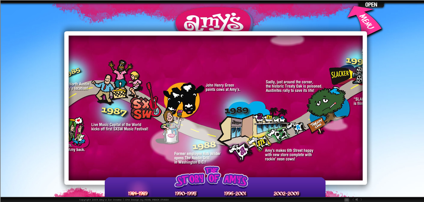
Website Research - Amys Icecream

I really like Amy’s Icecream website because it is colourful and enticing. Amy’s use of a fully interactive website not only draws you into exploring, but use of simplistic navigation keeps it understandable for everyone. I like how they have used an icecream on top of a cone as the basis of the world. This is a great way of enticing viewers into buying the product.
Another great feature is in the way they present the history/company details in an interactive timeline (below). This is a very good way especially for a young audience to grasp the concept of information using images. Another good use of illustration I like is the loading bar; they use the company’s cartoon (a cow) as the background as the numbers start to count up.

Sunday, 18 April 2010

Subscribe to:
Posts (Atom)