 6 errors to go....
Showing posts with label Gayr Stares. Show all posts
Showing posts with label Gayr Stares. Show all posts
Wednesday, 26 May 2010
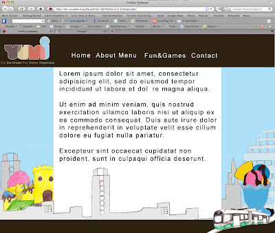
Website hotspots
- We wanted to created a dynamic page that catches peoples attention on their first impression so we have done a page that you don't have to scroll down (to save their time).
- We have designed it to have all of the major elements on the areas that people generally look at on a page to give them quick, informative information.
Tuesday, 25 May 2010


As we have developed the game we have taken it in stages to develop the games sophistication. We began by labelling and using as3 for 2 of the ice cream scoops to get it working which has turned out fine but once we started using an array to make all of the movie clips be scooped and move with the key board.
Tuesday, 18 May 2010
Game Screenshot

This is a screenshot of hte game that we have been working on. The idea is that the user selectsfrom the ice cream down the left hand side of the page and it appears in the ice crream scoop. The user then moves the ice cream to above the sundae bowl to drop it in. Once the ice cream has been made it can be printed off in a voucher to take into the shop and get made.
When the mouse hovers over the different Ice cream colours text will apear telling the user what flavour they are selecting.
Tuesday, 4 May 2010
Client website inspiration
The below sites are a few of the clients favourite websites that could be related to his business.
This site could be a good one to look at as it is about people enjoying the product, which the client wants. It has bright colours that accentuate the site and draw your attention to certain areas in a subtle way. The use of people means that the audience has some one to relate to.
 Bright colours and character attracts the audience.

New Action plan
Today we all met up as a group to discuss some trouble we are having with our client. We are finding that we are running out of time because we have had to spend a lot of time coming up with mock-ups of which the client hasn't been entirely happy with. He has had very specific ideas that are not achievable, such as 3D rotating ice-cream, a two player ice cream flash game with different levels and more. He has also changed his theme with each set of mock-ups, he's gone from 50's American diner to the concept that YUMi is the only ice cream parlour in Nottingham and is about the people (eat ice cream for daily happiness).
Problem's with the Mock-ups (from his point of view):
- The concept isn't literal enough. He wants people sharing and enjoying ice cream together
- He wants iconic buildings of Nottingham to be made out of ice cream to show that YUMI is the only ice cream parlour in Nottingham.
Want we need to do:
- Go back to the requirement stage and ask ourselves what is this site for?
- Build the site based on one of our designs and test the functionality
 The above diagram is based on the development cycle we need to go around a few times to see if our site is user friendly and not to heavily based on how pretty it look, which is the way the the client is seeing it from. We are doing one last mock-up and and making him choose for the project and the building on it after the deadline so his needs don't get in the way of the time scale.
Also we have assigned ourselves different roles so that we can develop our personal professional practice
ERD Diagram- Nick
Gallery-Nick
Build in Dreamweaver- Nick
Project management/client liaison- Gayr
Javascript to change background design- Gayr
FB link/ widget- Emma/Gayr
Voucher design- Emma
Flash game-Will
Photo up loader (PHP)- Will
Friday, 30 April 2010
More Mock-ups
I have created This mock-up from he clients feedback. He wanted his USP to be that he is the only ice cream parlour in Nottingham so we have gone with a bright, family friendly colour scheme. I went for a hand drawn theme to emphasis the welcoming feel that YUMI has.
I put a tram in there to represent Nottingham and YUMI is right next to the Hyson Green tram stop. I also made the castle out of ice cream to track a journey through Nottingham to get to YUMI.

I put a tram in there to represent Nottingham and YUMI is right next to the Hyson Green tram stop. I also made the castle out of ice cream to track a journey through Nottingham to get to YUMI.
Thursday, 29 April 2010
YUMI Theme
So far we have been getting mixed messages bout exactly what the theme is. We have been asked to create a 50's style diner but on feedback from our previous mock ups there are only a few elements he like such as, The layout that uses images as navigation, the black footer that has ice-creams coming out of it and the collage on another mock up. So below The YUMI's owner has given me these images that he likes. Each picture has a theme that interlinks with each other.
Quality family time and sharing-
 Family fun/childhood/retro-
 Retro, yummy childhood deserts-
 Retro, engages with the public-
 Childhood illustration-
 Again childhood illustration-
 Childhood/family-
 Overall these images reflect a sense of childhood fun. Whilst talking to the owner he asked for a theme that incorporates a retro sense of the 50's. It's about having a modern environment with a modern twist.
 Also the ice creams UPS (unique selling point) is that it is the only ice cream parlour in Nottingham (that has a presence on the web anyway) therefore he suggested another theme based upon this idea. That yumi is in a unique place, selling unique ice cream and is one of a kind within Nottingham.
We have started developing mock ups based on this theme.
Friday, 23 April 2010
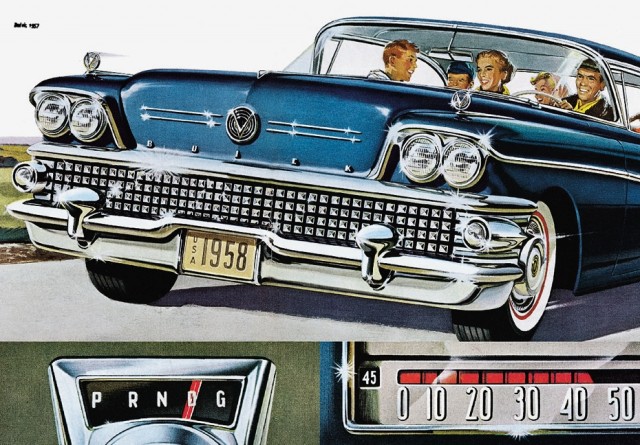
The Iconic 50's
These are just a few images that I think sum up the 50's. The 'perfect' family, the beautiful housewife, the cars, the music. It has got me thinking about what elements out of the 5's will attract students and families to YUMI. It needs to be retro but sleek.


 http://www.illustrationfriday.com/index.php
I found this illustration on the above site. A little illustration inspiration...
More Mock-Up's
All the mock ups are awaiting feedback from the owner of YUMI and are purely first drafts to see what elements he does/doesn't like.
Mock up One:
 Mock up Two: I wanted the illustration to do the talking, providing the audience with a fun, vibrant vision of YUMI. I think the lady eating ice cream is a success but the two boys don't supply YUMI with a family friendly image.
 Mock up Three: A more 'grown up' approach. I think the imagery work well as links to grab peoples attention
Monday, 19 April 2010
Yumi Mood Boards
I have made two mood boards to help express the theme of Yumies and to help the design process along between the client and ourselves.
Mood Board One: This is about 1950's American diner culture that has a more 'adult' feel. It's about elegance, bold colours working together and iconic symbols of 1950's America- the retro phone, the glamorous women and of course the traditional 50's family.

Mood Board Two: I have used delicate pastel colours, typography and food to express a mood more about the food that YUMI's serves.


Friday, 16 April 2010
Ice cream brands


Ben and Jerries, Haagen Das and Baskin robins are three of the most famous ice cream brands throughout the world. Each one has become a household name in it's own right. All three are known for different reasons. Ben and Jerries comes from humble beginnings of two friends quitting uni and spontaneously creating fmaous flavours such as cookie dough and fish food. Haagen das is known for it's luxurious ingredients.
What makes these brands successful? I think they all bring a sense of relaxation, comfort and self indulgence that we are all attracted to.
In terms of design they are all very different companies, pitching to different audiences. Haagen das uses rich colours to suggest high class decadence. Whereas Ben and Jerrys and Baskin Robins (the American companies) have gone for a bolder, more fun design that makes use of colour and fun typography to attract their audience.
Yumi's Brand: I think Yumi's brand is about bringing people together of all nationalities, ages etc to enjoy a fun, sleek 50's style diner. I want to advertise their 50+ flavours of ice cream, the late closing times (to attract students). Also a USP is that it is owned by a young 3rd year student so it suggests friendliness and opportunities.
YUMI's plan
- Meeting with Client 01/04/10 - 28/05/10
- Research-50's style/ American diners, ice cream parlours, ice cream bands/ illustrations 3 Days 14/04/10 - 16/04/10
- Content 19/04/10 - 21/05/10
- Photoshoot 2 Days 14/04/10 - 15/04/10
- Wireframes 16/04/10
- Mock-ups 21/04/10 - 23/04/10
- Flash game 26/04/10 - 03/05/10
- Content In Dreamweaver 19/04/10 - 28/05/10
- Widget conected to facebook 03/05/10 - 05/05/10
- RSS feed/ blog 12/05/10 - 14/05/10
- Lightbox for external site links? 16/05/10 - 18/05/10
- Image of the week (Content)
- Characters (Content)
- Illustrations (Content)
- Voucher design and uploads (PHP) 03/05/10 - 21/05/10
Subscribe to:
Posts (Atom)