Our website validated, we had difficulty with javascript but overcame it.


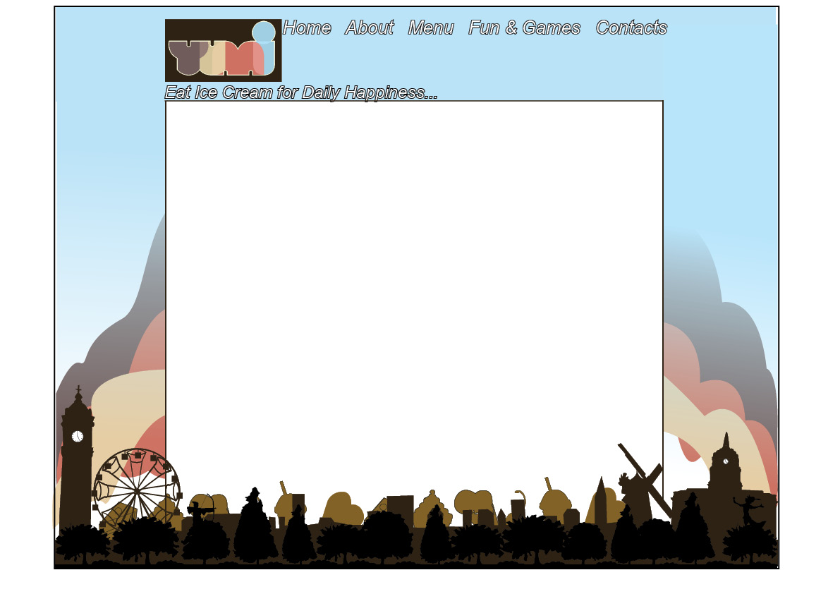
 Bright colours and character attracts the audience.

 The above diagram is based on the development cycle we need to go around a few times to see if our site is user friendly and not to heavily based on how pretty it look, which is the way the the client is seeing it from. We are doing one last mock-up and and making him choose for the project and the building on it after the deadline so his needs don't get in the way of the time scale.


 We though t we'd see how photos look with the mock up as it was one of his favourite elements before but we decided it was too much imagery.
 No colour=very boring
 Doesn't look balanced with the shorter header.
 Family fun/childhood/retro-
 Retro, yummy childhood deserts-
 Retro, engages with the public-
 Childhood illustration-
 Again childhood illustration-
 Childhood/family-
 Overall these images reflect a sense of childhood fun. Whilst talking to the owner he asked for a theme that incorporates a retro sense of the 50's. It's about having a modern environment with a modern twist.