Friday 30 April 2010

Rough Game Design 1


Above is the initial rough design for the game on the Yumi Website, the idea is to create your own sundea by selecting 3 flavour ice cream scoops and three toppings of choice. Your selection will then be printed off and act as a voucher if taken into store, where your personalised ice cream will get you 15% off.

More Mock-Ups


Mock Ups Round 2


More Mock-ups

I have created This mock-up from he clients feedback. He wanted his USP to be that he is the only ice cream parlour in Nottingham so we have gone with a bright, family friendly colour scheme. I went for a hand drawn theme to emphasis the welcoming feel that YUMI has.


I put a tram in there to represent Nottingham and YUMI is right next to the Hyson Green tram stop. I also made the castle out of ice cream to track a journey through Nottingham to get to YUMI.

Yumi re-design mockups

After receiving feedback from our client we have taken into count his opinions and came up with new designs.


Thursday 29 April 2010

One of a kind in Nottingham

We developed a few basic mock ups to give us a starting point based upon the idea that YUMi is the only ice cream parlour in Nottingham. We thought a drawn city at the bottom of the content would flow nicely and allow the viewer to get a sense of where, why and what yumi's is. We worked with different colours for the background but the light blue worked out the best as it reflects that logos colour and gives the general site a positive feel.
We though t we'd see how photos look with the mock up as it was one of his favourite elements before but we decided it was too much imagery.
No colour=very boring
Doesn't look balanced with the shorter header.

YUMI Theme

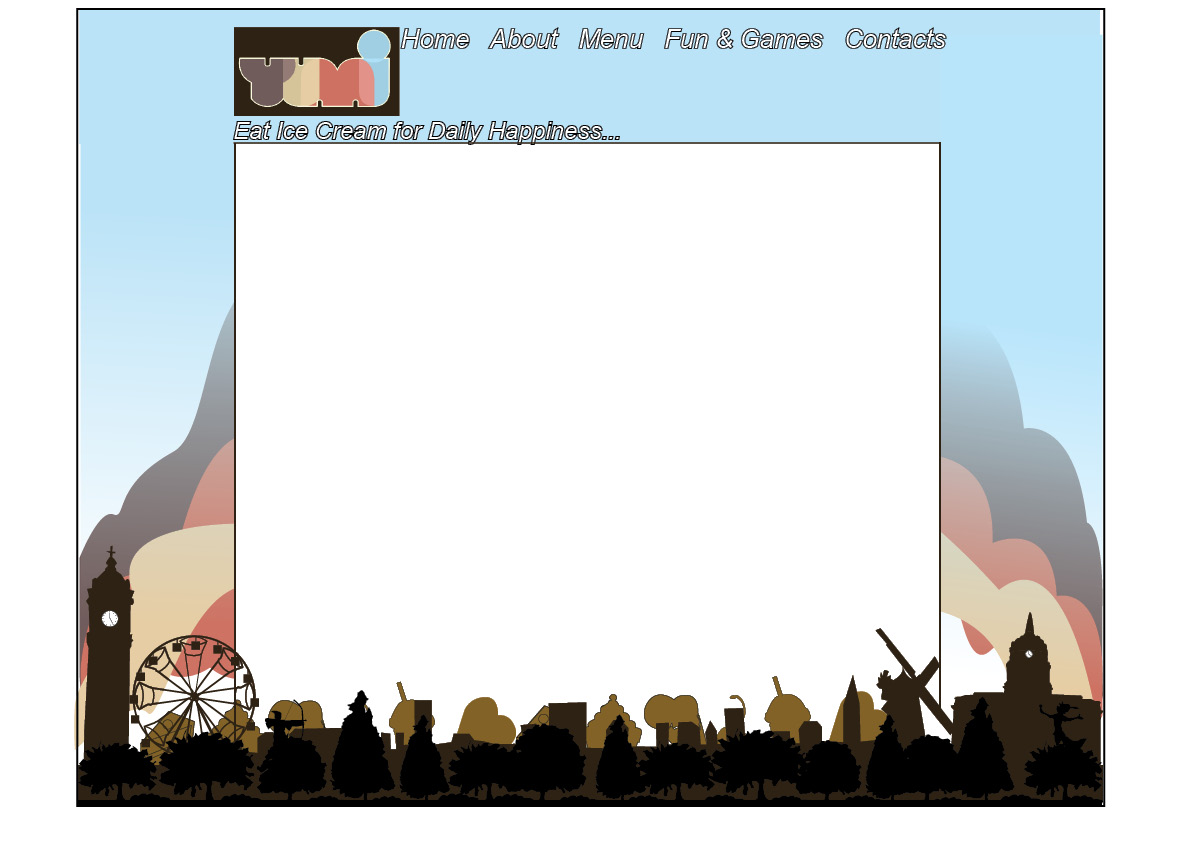
So far we have been getting mixed messages bout exactly what the theme is. We have been asked to create a 50's style diner but on feedback from our previous mock ups there are only a few elements he like such as, The layout that uses images as navigation, the black footer that has ice-creams coming out of it and the collage on another mock up. So below The YUMI's owner has given me these images that he likes. Each picture has a theme that interlinks with each other.

Quality family time and sharing-
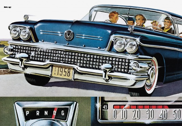
Family fun/childhood/retro-
Retro, yummy childhood deserts-
Retro, engages with the public-
Childhood illustration-
Again childhood illustration-
Childhood/family-
Overall these images reflect a sense of childhood fun. Whilst talking to the owner he asked for a theme that incorporates a retro sense of the 50's. It's about having a modern environment with a modern twist.

Also the ice creams UPS (unique selling point) is that it is the only ice cream parlour in Nottingham (that has a presence on the web anyway) therefore he suggested another theme based upon this idea. That yumi is in a unique place, selling unique ice cream and is one of a kind within Nottingham.

We have started developing mock ups based on this theme.

Tuesday 27 April 2010

Friday 23 April 2010

The Iconic 50's

These are just a few images that I think sum up the 50's. The 'perfect' family, the beautiful housewife, the cars, the music. It has got me thinking about what elements out of the 5's will attract students and families to YUMI. It needs to be retro but sleek.


http://www.illustrationfriday.com/index.php

I found this illustration on the above site. A little illustration inspiration...

More Mock-Up's

All the mock ups are awaiting feedback from the owner of YUMI and are purely first drafts to see what elements he does/doesn't like.

Mock up One:
Mock up Two: I wanted the illustration to do the talking, providing the audience with a fun, vibrant vision of YUMI. I think the lady eating ice cream is a success but the two boys don't supply YUMI with a family friendly image.
Mock up Three: A more 'grown up' approach. I think the imagery work well as links to grab peoples attention

First Mockup Designs continued...


First Mock Up Designs


Monday 19 April 2010

Yumi Mood Boards

I have made two mood boards to help express the theme of Yumies and to help the design process along between the client and ourselves.

Mood Board One: This is about 1950's American diner culture that has a more 'adult' feel. It's about elegance, bold colours working together and iconic symbols of 1950's America- the retro phone, the glamorous women and of course the traditional 50's family.

Mood Board Two: I have used delicate pastel colours, typography and food to express a mood more about the food that YUMI's serves.

Ice Cream Parlours - Research

These are some Interiors of Ice Cream Parlours researched. They all also seem to have an American Diner feel to them which is what our client wants to come across in the website as his is also like this.